Redesigning IRCTC – Where Design Meets Daily Commute
Designed By
Akshat Khare
Timeline
2 weeks
Read In
15 mins
Roles
Identifying the Real Problem
The Challenge
The Indian Railway Catering and Tourism Corporation (IRCTC) platform has been the go-to site for railway bookings in India since 2002. However, in recent years, its user experience has fallen behind modern digital standards. From confusing flows to an overwhelming layout, the site frustrates users at almost every stage of the journey—from search to payment.
Mission
To modernize IRCTC by redesigning its core website interface to reflect clarity, structure, and emotional connection—making ticket booking not just easier, but enjoyable.
The Goals Were Clear
Drastically improve usability
Refine visual hierarchy and clarity
Simplify complex flows like booking and payment
Ensure accessibility and inclusivity
Incorporate delight and gamification to encourage repeated use
Understanding the People Who Use It
I conducted surveys with 20+ users of IRCTC through Google Forms to understand the pain points, frustrations, and aspirations of real passengers. This research fed directly into two personas:
The Curious Educator
A teacher with a love for traveling to different parts of India during vacations. She values clarity, speed, and the ability to compare options.
The Corporate Booking Assistant
An office manager responsible for booking tickets for executives. Efficiency, accuracy, and quick rebooking options are top priorities.
Pain Points I Unearthed
Here are the most common challenges users faced on IRCTC:
A Lean UX Approach
To keep the process agile and user-focused, I adopted a Lean UX methodology:
📄
👤
✏️
✅
💻

Home Screen
❌ Before
Cluttered header with too many options and icons, leading to decision fatigue.
Lack of visual hierarchy — everything screamed for attention at once.
Outdated UI with overwhelming information, random widgets, and confusing CTAs.
Banner ads and irrelevant promotions dominated above-the-fold space.
No personalization or smart suggestions.
✅ After
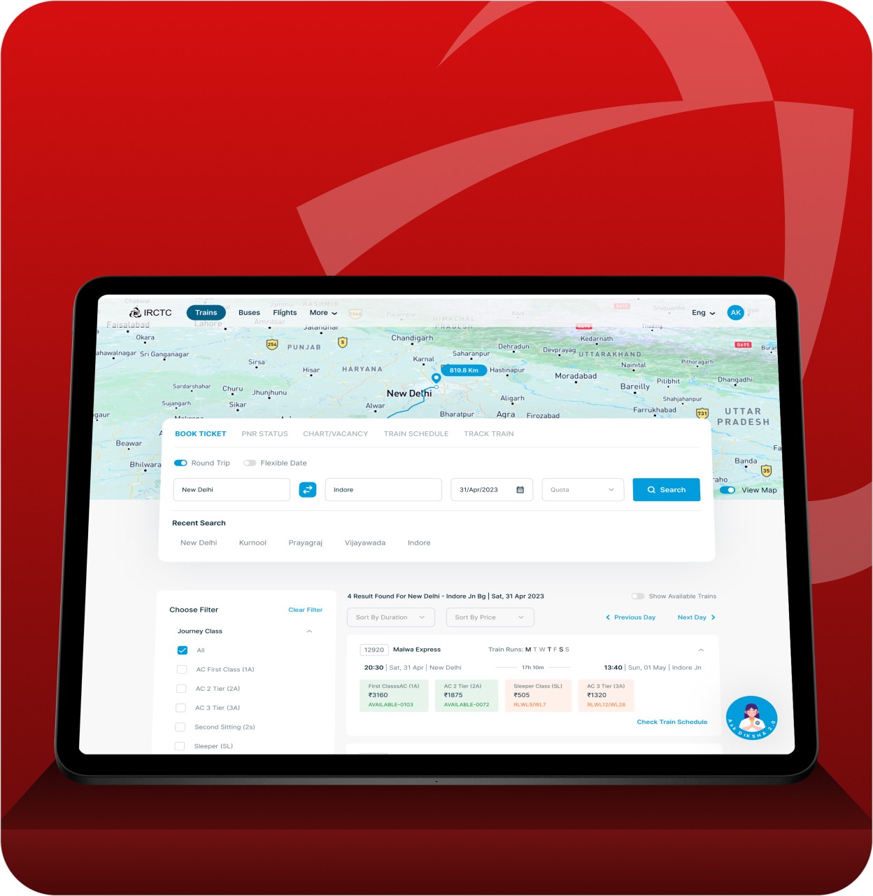
Clean, minimal layout with essential CTAs: Book Ticket, Check PNR, Live Status.
Decluttered navbar with collapsible menus and modern icons.
Personalized section: “Your recent searches”, “Saved routes”.
Smart use of whitespace and a grid system (12-column, 130px margins).
A prominent search bar with auto-suggestions based on user behavior.
Train Availability / Search Results
❌ Before
No sorting/filtering by price, time, or class.
Cluttered train details — all information jumbled together.
Small, poorly positioned video content that distracted from the main task.
Irrelevant info like “Book a cab” showing up during train selection.
✅ After
Smart filters added: Sort by Price, Travel Time, Class, Availability.
Train cards redesigned for clarity: showing Departure, Arrival, Duration, Price, Availability, and Book CTA in a clean visual block.
Option to compare multiple trains at once.
Clean icons for Train Class, Seat Availability, and On-time Score.
Removed videos; instead, added tips for budget travel and IRCTC rules contextually.


Passenger Details
❌ Before
Ad banners placed above the passenger info form, leading to frequent misclicks.
Repetitive manual form-filling for frequent travelers.
Disorganized layout with inconsistent font sizes and overwhelming text.
CTA button (“Continue”) hidden below the fold.
✅ After
Ads removed from the form area completely.
Implemented saved passenger profiles for faster checkout.
Grouped fields for better form flow (e.g., Name, Age, Gender bundled).
Progress bar added at the top (e.g., “Step 2 of 4: Passenger Details”).
CTA (“Continue to Payment”) made sticky at the bottom for quick access.
Payment
❌ Before
Overloaded with logos of all payment providers.
Multiple payment steps with too many redirections and unclear feedback.
OTP prompt on a separate screen — breaking user flow.
Unclear total fare breakdown.
✅ After
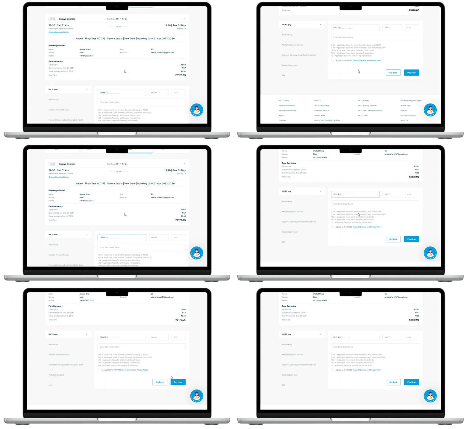
Payment methods grouped into tabs: UPI, Card, Netbanking, Wallets.
Smart autofill for saved cards and UPI IDs.
OTP input designed as a popup modal — avoids breaking context.
Clear, concise fare breakdown with tooltips for taxes, service charges.
Success and failure messages are contextual and user-friendly.

Booking Confirmation / eTicket
❌ Before
Separate page for confirmation; user has to manually go find ticket to download.
Railway chatbot floating over key content.
Redundant details repeated without structure.
✅ After
Booking confirmation shown in a sleek modal or confirmation screen.
Download, print, or share ticket options shown prominently.
Smart summary card at top with Train Info, PNR, Date.
Bot now tucked in a help icon on bottom-right, accessible but not intrusive.
Prompt added for booking a return ticket with pre-filled details.
Future Enhancements
While the redesign addresses key usability issues and visual clutter, there’s still room for further optimization. Here’s what I would explore next:
AI-Powered Recommendations: Suggest alternate trains, faster routes, or cheaper dates using an AI assistant.
Voice Search for Bharat Users: Introduce voice-based train search in regional languages.
Dark Mode Toggle: Especially helpful for night-time users or frequent travelers.
Live Coach Position & Platform Info: Show real-time coach placement at stations with maps.
Loyalty & Travel History Insights: Introduce points, badges, or a simple dashboard summarizing past trips.
Final Thoughts
This redesign was more than just a visual revamp — it was a design rethink of how India books train tickets. IRCTC holds a massive user base from Tier-1 to Tier-3 cities, and the goal was to make the experience:
Simpler for first-timers
Faster for frequent users
Smarter for planners
From cleaning up clutter to introducing context-aware steps, the new design aspires to make train booking a pleasant part of the journey, not a hurdle.
In a country where trains are not just transportation but a lifeline — design has the power to create real impact. And this project was my small attempt to make that happen.
Let’s Talk
Thank you for exploring this project. I'd love to hear your thoughts or feedback!
You can connect with me on LinkedIn, Behance, or simply email me at akshatkharex@gmail.com